Discover Tshwane Innovation Challenge, Team Collaboration
As a team, we understood the Discover Tshwane Innovation Challenge as an opportunity to create a destination brand identity that communicates the diversity, heritage, and unique experiences offered by South Africa’s capital city. The brief emphasised the need for a stronger tourism brand that appeals to both local and international visitors while positioning Tshwane as a destination for culture, history, nature, innovation, and adventure. To guide our creative direction, Discover Tshwane provided us with a colour breakdown, examples of logo variants, graphic style interpretations, and typography guidelines specifying Nyala, Helvetica, and Arial. We used these elements as the foundation of our design process to ensure that our concept remained aligned with the city’s intended brand identity while presenting its tourism offerings in an engaging and distinctive way.
The logo represents Tshwane as a destination where history, nature, culture, sport, and modern development come together. The flowing graphic forms symbolise a journey of exploration, connecting the different attractions and experiences the city offers. The wildlife imagery represents opportunities to experience South Africa’s natural heritage, while the sporting symbols communicate energy, recreation, and active lifestyles. The architectural landmark and city skyline represent Tshwane’s historical significance, government institutions, urban development, and role as a centre of innovation. Together, these illustrations communicate that the city offers more than one type of tourism experience.
The large black initial serves as a strong visual anchor and represents the starting point of discovery. We interpreted black as a symbol of the unknown: the experiences, places, and stories that visitors have yet to discover. It represents the curiosity of someone who does not yet know everything Tshwane has to offer but is eager to explore, learn, and uncover its hidden attractions. The colourful graphic forms extending from the initial represent the discoveries that follow, revealing the richness and diversity of the city. Through this concept, we wanted to communicate that discovering Tshwane is a journey from the unfamiliar to the extraordinary.
Brand Identity Breakdown
Logo Design
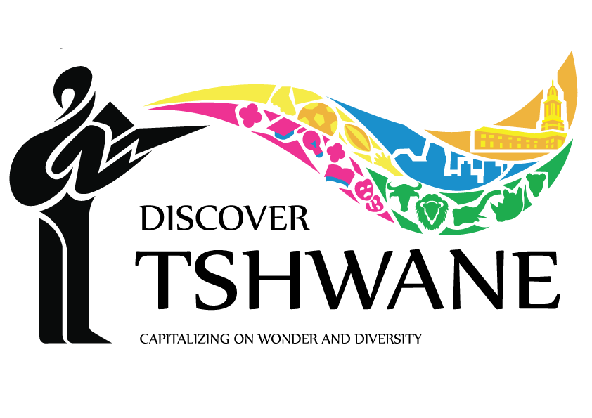 Colour logo
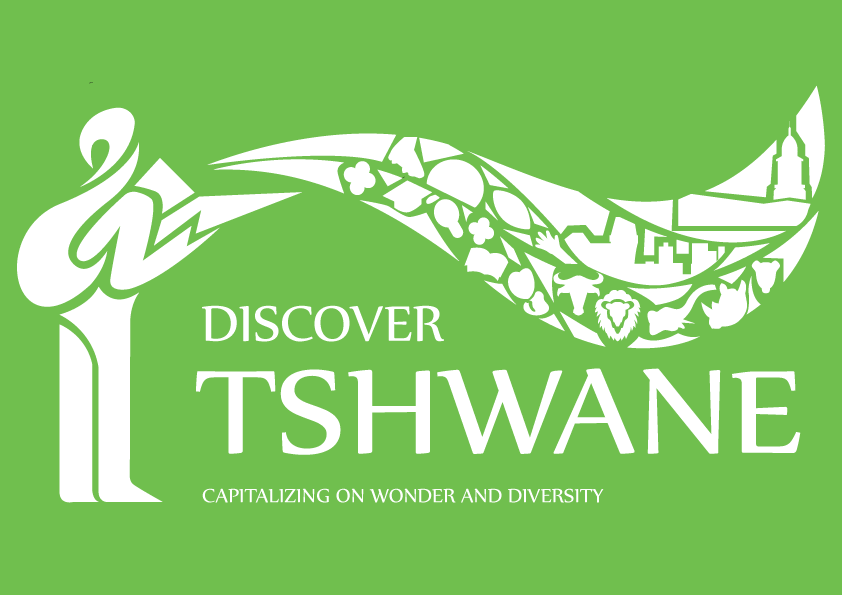 White
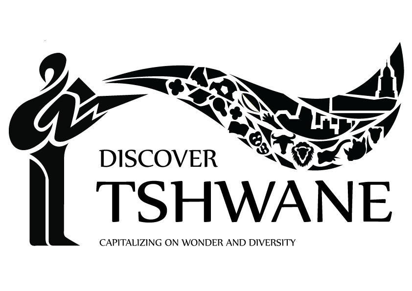 Black
 Grayscale
Colour palette
- #EE3293
- #F6EC48
- #EFB43F
- #1EAE54
- #1A90CC
- #000000
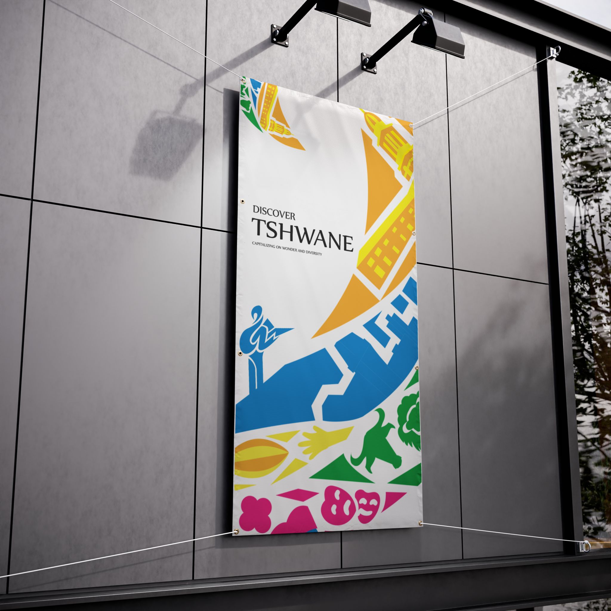
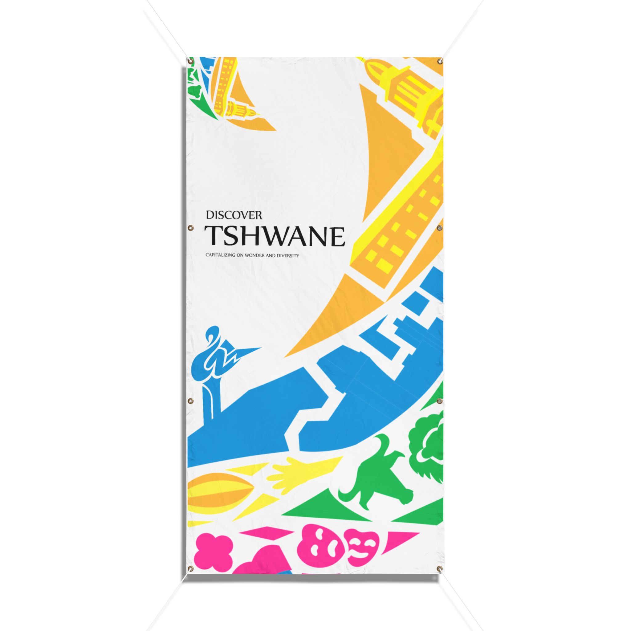
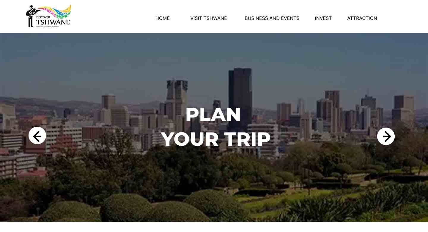
Brand Application


Credit
Logo Design: Katlego Moakamela (Me)
Logo Application: Preston Mahlangu